
You’ve probably heard it already — but landing pages can make or break an online business. Thankfully, creating a good one isn't quantum physics, but it does take a bit of work. You might be surprised, but making high-converting eCommerce landing pages means doing more than making them look good.
Don’t worry, though — we’ll go back to basics, keep it simple, and unleash your perfect landing page in no time at all.
Let’s break it down.

What The Heck Is a Landing Page?
Before we can get into the nitty-gritty of building the perfect landing page, you should know what it is and why it's so damn important.
Basically, a landing page is the first thing your customers see when they interact with your business. And as everyone knows, first impressions stick. That's why you need one that will make your customers want to stay and poke around your website — and who knows, they might even end up buying something.
To put it in more technical terms, though — a good landing page pumps up your conversion rates, helping you reach your growth or marketing goals. And a landing page can be almost anything, really. It can be your homepage, or a special standalone page designed for a specific product, campaign, or even a sale — or any other page on your website.
Hold On, Is It Just a Landing Page?
If you’re confused about the whole homepage vs. landing page distinction, don’t worry; you’re far from the only one. It’s something people get confused about often. So, let’s nip that in the bud and clear it up.
Essentially, most of the confusion comes down to how people find your page and why that page exists. Most people find homepages through either social media through positive reviews or word of mouth. On the other hand, they find landing pages organically in most cases; through keywords or search results.
Homepages have an important function in the context of general Internet browsing — they’re the “hub” of any website; the first page from which you navigate to the other individual pages.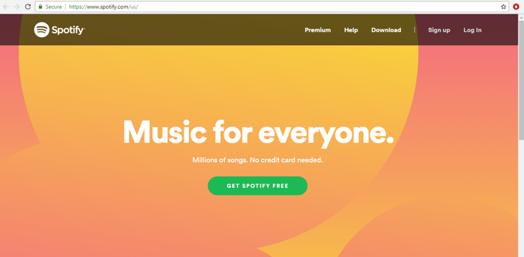
But hold on — isn’t a landing page pretty much the same thing?
Well, no.
When a brand creates a homepage for their website, it’s where the user will first come into contact with the brand. The homepage explains what the company is about, showcasing its niche and services in general.
However, the landing page is more single-minded — it’s supposed to drive the user towards buying a specific product or enlisting a specific service.
And yep — you need both.
Every page has its own role, its own purpose. Whether it is a gateway to the rest of your website (i.e., your homepage) or to inform about a specific part of your business, you will usually promote your landing page through Google Adwords or similar services, and it exists only to convert.
Why Do I Need High Converting Ecommerce Landing Pages?
Okay, so the reason you need eCommerce landing pages that convert is kinda obvious — feel free to imagine that classic “ka-ching” sound right here. Yep, you want to sell your products or services and make money - turning visitors into customers.
But an effective landing page has other benefits as well:
- SEO Ranking - Good landing pages are carefully made to target specific search terms. Add a bit of Google Adword promotion or other boosting methods to that, and the result is your landing page moving up in SEO rankings. And that means more sales, better promotion for your business, and more exposure for your product.
- Sales or Product Promotion - If your landing page focuses on a specific part of your business, like a product, or perhaps a sale or promotion, then it sort of functions independently from the rest of your website. Don’t be alarmed, it’s not Skynet and it’s not becoming self-aware. This is actually a good thing; it can guide people to a specific aspect of your business that you want to focus on. Another perk of specific landing pages is that it allows you to measure the success of a particular service, product, goal, set of keywords, or pretty much anything that’d you’d want to quantify.
- Ease of purchase/subscribing - High conversion results of a landing page serve one goal — to nudge your visitors down the right path; hopefully one that doesn’t end with an abandoned shopping cart. All kidding aside, though, that right direction can be anything you need: buying, signing up, subscribing, or joining.
A Hard Pill to Swallow
Okay, by now you’ve probably scoured the Internet for that one “Ultimate Guide To Landing Pages.”
And ironically — you’ve probably found yourself in the middle of some landing pages of sketchy guys selling you guides to making perfect landing pages.
Before all of this gets too meta for you, you mustn’t remember something — there is no real manual for this stuff.
Sure, there are some basic ground rules on how not to make a crappy landing page. But essentially, each landing page is different because each product or service you’re promoting is different.
There’s no lightning in a bottle; no perfect template that brings results to everyone no matter what.
However, there is one thing that every good landing page does: it keeps its viewers in mind. A well-made landing page is tailored to its intended audience.
So yeah — a landing page that sells shoes to marathon runners is going to be different from a winery's call for sommeliers.
And yes, you've come here to learn how to create high converting eCommerce landing pages — not read about how there is no magic formula. Don’t worry, you’re not clicking away from this page empty-handed.
Luckily for every budding landing page builder out there, it turns out that there are more things high-converting landing pages have in common.
Let’s get right to it!
How to Create an Efficient Landing Page
Before you even start creating your landing page, you should sit down and think about what you really want.
And yeah, smartypants — we know you want to build a landing page.
But what does it need to accomplish? Do you want to promote a fresh new product? Or your latest insane discount? Maybe you’re looking to grow your newsletter list? Setting concrete goals is just as important as designing the page itself — sometimes even more so.
Once you’ve figured out your goals, you need to think about the messaging of your key benefits. How can your product/subscription/newsletter be useful to potential buyers? How can it solve their problem? The people in fancier suits would call that a “unique value proposition” — but we don’t have to get so technical.
When you’ve figured out what’s the value you can communicate to your customers, it’s time to do some keyword research. And sorry, this part is a bit boring, but a very necessary one nonetheless.
Ask yourself — what do your potential customers search for online that you and your business can provide?
When you've got all of that down, it's time for the really fun part — designing your landing page. First, you should think about which elements are needed for your page; a CTA, a fillable form, maybe even a short sales pitch video? It’s all up to you, but it still depends on what your landing page is trying to accomplish.
Let’s go over some elements that are hallmarks of high-converting landing page design.
Must-Have Landing Page Elements
Like we said earlier in the article, there are some commonalities shared between most successful landing pages. Try and include as many of these elements as you can because they will visibly increase the efficiency of your landing pages.
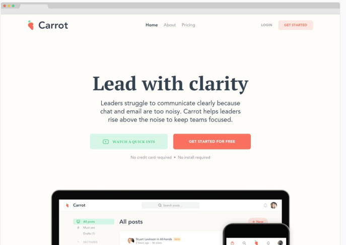
Gripping Headlines
A very obvious one, but still paramount. It is the first thing people’s eyes will be drawn to when they open your page. A strong headline is what will compel your potential customers to stay and learn more about what your business is offering. Here’s a couple of tips that will help you write a great headline:
- It should be short. Never go over 20 words if you can help it.
- It should grip the reader’s attention.
- It should communicate what product or service you’re offering.
- If you have an image accompanying the headline, even better. A picture is worth a thousand words.
Convincing Subheadlines
Think of it this way: headlines attract the reader, and subheadlines compel them to not click away; instead, they stay and learn more. When properly combined, the two are the main weapons in your landing page's arsenal.
Good subheads will almost always be:
- Right below your main headline (duh)
- Persuasive and convincing
- A bit more detailed than your main headline
Arrange your content so that it clearly explains what you're offering and how that can help your page's visitors. And then, use the subheadlines to headline these smaller chunks of content.
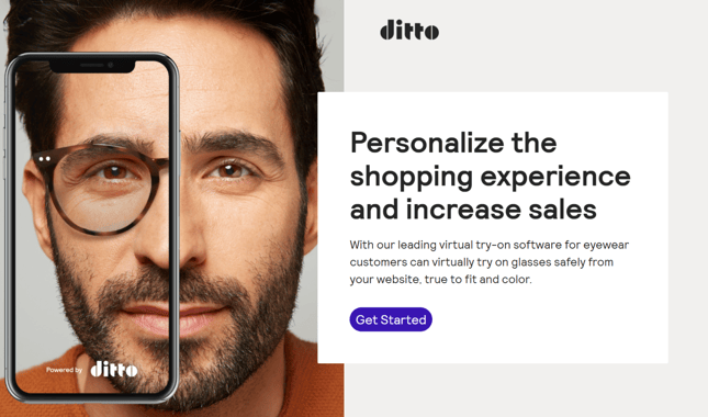
A Picture Is Worth A Thousand Words
Inexperienced business owners sometimes forget the power of high-quality images — but you’re not going to be one of them.
Remember, visuals are one of the most important components of high-converting eCommerce landing pages.
It all comes down to basic psychology, really. The human mind is much more attuned to visual imagery rather than text.
Think about it — you have to actively learn to read, but (almost) everyone can see with their own eyes. It’s the way we’ve evolved as a species; visual communication can be much faster (in fact, about 60,000 times faster) than textual communication.
Of course, you don’t want to add just any old images to your landing page. Here are a couple of basic guidelines:
- The images should be large and noticeable.
- Obviously, they should be relevant to what you're offering. For example, if you're selling a physical product, you must have an image of the product itself on your landing page. No one wants to buy something physical without seeing it with their own eyes.
- On the other hand, if you're offering a service, you have a bit more wiggle-room. In that case, the image should captivate and demonstrate why your service is what the visitor has been looking for all this time — you can be less literal with your visuals
- The image needs to be high-quality. Low-quality images are an instant turn-off for customers.
So, if you're not a designer yourself, spring some extra cash and hire a good one.
Your landing page isn't the place for amateurish photoshops or stock images. Remember, your chosen image will be the first thing a potential customer sees, even before reading your headline or any subheadings.
Let's Be Clear About This - Literally
Clarity is a very important aspect of a high-conversion landing page design.
People need to understand what your product/service/promotion is — within seconds of opening your page.
And if they're interested, they need to understand the details within minutes. If they don't quickly grasp what you're offering, they're gone for good. The human attention span is extremely short online — which is why someone not interested in landing pages has clicked away from here in the blink of an eye.
Your copy needs to reflect this need for clarity. If you’re offering a relatively simple service or product, you can often get away with just headlines and subheadlines.
Always keep in mind these things when writing:
- Your explanation doesn't have to be integrated into your headlines; they can be completely separate.
- Explanations always need to be benefit-oriented — showing how your product or service will benefit the potential customer.
- Substance over style. Keep it simple, skimmable, and short.
We know that your product is unique (though let’s face it, most aren’t), but try to simplify it as much as possible. If you get bogged down in complicated explanations or tons of copy you think is quirky and comedy gold, you’ll lose the interest of your readers quickly.
Let’s Talk About Pain
What the heck? What does pain have to do with anything?
Calm down, we’re not peddling an acupuncture class here.
Rather, we’re talking about the “pain” your customers will try to avoid — and your landing page is there to show them how to do it. And wouldn’t you know it; the best way is to buy what you’re selling!
If you can make someone see what they will lose if they do not take your deal, they will subconsciously try to avoid that "pain" and will be more likely to convert. Use human psychology to your advantage:
- Do not just talk about the benefits your potential customer can gain; mention what they might lose as well. Now, of course, don't overdo it. Too much "pain", and your potential customers will leave. This theory called loss aversion states that humans will be more focused on avoiding losses (pain) than making gains. It feels great to find 50 bucks on the street, but losing 50 bucks will be twice as intense; just in the other direction.
- Try and implement “pain” references in your testimonials (if you have any). Testimonials are great for building credibility, especially in this case.
- And of course the kicker: your service or product is the perfect “antidote” to that pain. Never present a problem without giving a solution!
In marketing terms, these are called “pain points”.
Okay, maybe we are selling that acupuncture class.
Let’s Talk About Pleasure
The other side of the coin is, predictably, pleasure. And it’s just as important as pain. Everyone wants to feel good (shocker), but you need to show how your product or service can provide that feeling. Incorporate the prospect of pleasure within your page copy:
- Show how your product or service will make people feel better by addressing their pain points.
- Show how your service or product will fill emotional needs, rather than just functional ones.
We’ll give you an example. You’re selling arthritis medication. So, what are you promoting, a pill?
Wrong! You’re selling a second chance at a youthful, joyous life. You’re selling freedom of movement — the biggest freedom there is; maybe illustrated by the possibility of freely playing with grandkids?
It’s very important to illustrate how your product will make someone's life better in a relatable way, not just the useful function it performs. You need to go beyond the curve — chase the feeling your target audience have after using the product to solve their problems, not the problem-solving itself.
Contacts, Communication, and Availability
People like knowing they’re dealing with a legitimate business. And the best way to prove that is to give them various ways of getting in touch with you.
Phone numbers, street addresses, an email address, fillable contact forms; the more you have, the more professional and legit you will seem.
In an age of online scams and shady business practices, all of this helps strengthen the trust in your company.
These are some useful things to keep in mind when adding contact information to your landing page:
- It might seem obvious, but try and have some proof that you’re a real company. Most often, this means having your physical address and phone number in a visible place.
- Live chats go a long way! However, they’re not a must-have, and the jury is still out on their effectiveness, especially if you plan on using chatbots that many people find annoying.
Communication and availability go a long way in conversion — remember that when designing your high-converting eCommerce landing pages.
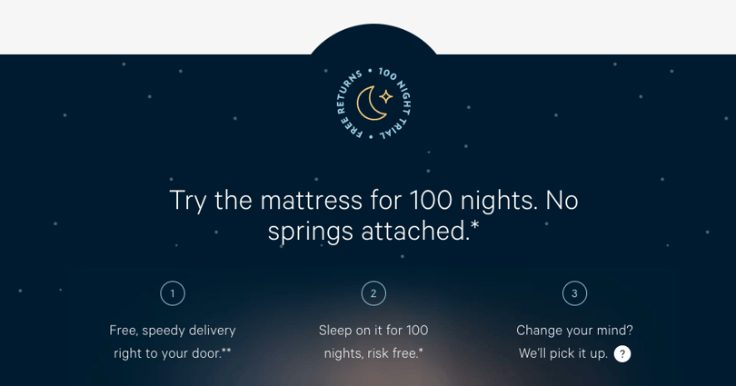
Guarantees
Everyone loves a safe bet, a guaranteed win. Guarantees help your customers feel safe and reassured while scrolling down your landing page. And that’s why they massively improve the likelihood of conversion.
Here’s a couple of tips for guarantees and how to present them:
- You can guarantee many things. Money back, free trials, etc — it’s all a good idea, as long as you can follow through. Once you think of what you want to guarantee to people, state it clearly.
- If you can’t have any explicit product guarantees (as mentioned above), provide more “soft'' guarantees like “100% No Spam”.
- Place the guarantees very near to your call to action. This works as an extra push for potential customers on the verge of conversion.
And never get bogged down in the technicalities of the guarantees. Just state them plainly and clearly, and people will get it.
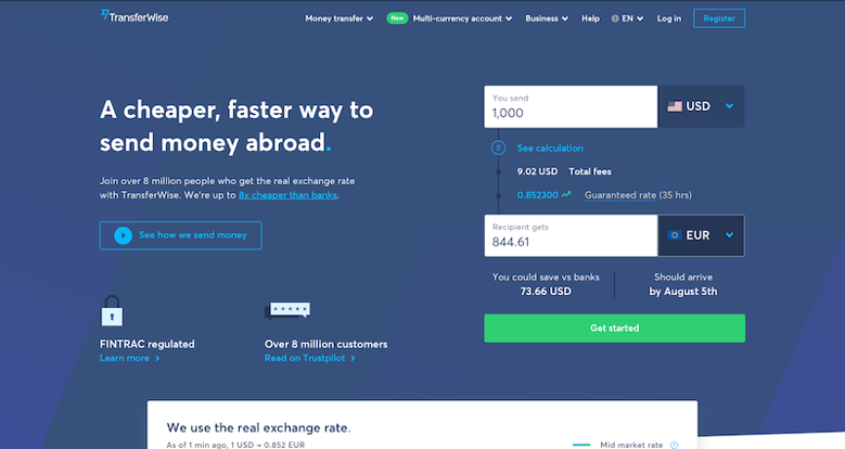
Compelling Call to Action
A powerful call to action is a must-have — it’s what you’ve been working towards the entire time. That’s why CTA's are the most famous part of landing pages. They can make or break your high-converting landing page design. Consider it as the 'action button'.
Feeling that pressure? Don’t worry, we’ve got a few tips on writing a killer CTA:
- Make it big, bold, and gripping.
- Use explosive, exciting, and compelling vocabulary.
- Avoid boring, everyday language like "submit" or "buy."
- Always use a button. Over time, our brains have become accustomed to the CTA taking the form of a button. Stick with the tried and true method, and don’t try to reinvent the wheel.
- Contrasting colours help your CTA stand out. It should be immediately visible and easily distinguishable from the rest of the page.
- If it makes sense, incorporate eye-catching graphics into your CTA button. However, be careful not to overdo it and take focus away from the CTA.
Advanced High Converting Landing Page Design Tips
While the previous section covers the must-haves, this one will cover the great-to-haves.
That’s right — you’ve made it to the advanced class, congrats!
Landing Page Builders
There are many tools out there for building the perfect landing page.
If we’re being honest — too many. So much so that It can be hard to find the right one for you. However, if you find the right one and stick with it, they can be a really cost-effective solution. When you're searching for builders, just keep your company's needs and goals in mind; along with the coding and design skill levels of you and your staff.
For beginners, landing page builders with a lot of premade templates are the best bet.
That will cut down the time needed to build a functional landing page while also easing you into the world of page design. Many of those types of builders have drag and drop design features, which can help you make a gorgeous page without much effort or technical know-how.
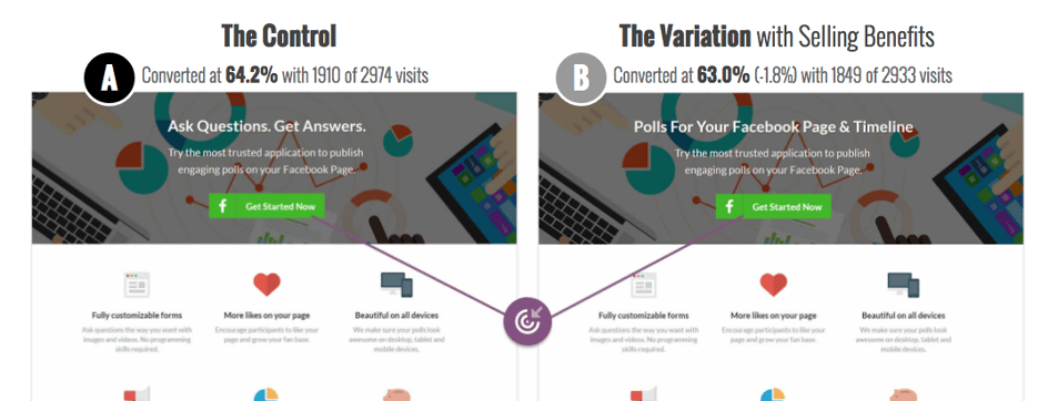
However, make sure that the builder you’ve picked has A/B testing and analytics options. This is a must because analytics allow you to track click-through rates, page views, scrolls depths, and other important metrics for high-converting landing page design.
Specifically, A/B testing helps you test out whether your potential changes have resulted in a better user experience. This kind of testing allows you to hone your page bit by bit and make it a conversion powerhouse.
Social Proof
Social proof usually refers to various social media metrics related to your website — likes, shares, pins, tweets, subscribers, you name it. Publicly displaying this information will help you with your conversion rates.
Why, you might ask? Simply put — people like stuff that most other people like.
Our entire mainstream culture is built on this simple truth.
No one wants to buy something that no one likes. But, on the other hand, people are notorious bandwagon (s)hoppers. If they see that you have a growing fanbase, they’ll automatically start seeing your business in a different light — like the popular kid in high school.
Research shows that 71% of millennials are more likely to purchase a product if it has been recommended by others online. So it’s no wonder that influencer marketing has dominated the market in the past couple of years.
Here’s a couple of ways to incorporate social proof:
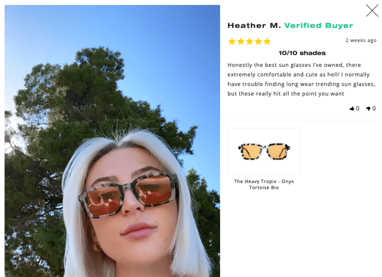
- Customer testimonials from actual people - Experts, scientists, and celebrity endorsements are all well and good, but people have grown numb to that kind of testimonial. That's why picking real people who are really happy with your business will yield much higher conversion rates. Keep in mind, people typically look up customer reviews before investing in a product or service.
- Always, and we do mean always use pictures in testimonials. People are visual creatures, and just having text for your testimonials casts doubt on their credibility. Pictures are the cornerstone of trust when it comes to testimonials.
- Be specific. General statements like: “oh, your business is great, enjoyed working with you 10/10” will do nothing for you. Testimonials need to show real data, real numbers, and exactly how your business helped your customer.
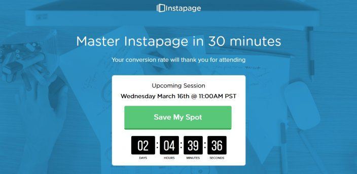
Sales Pitch Videos
Video is becoming the primary medium people consume information from online. In fact, over 80% of internet traffic is video. But, like we mentioned before, humans really are visual creatures.
That is why having a sales pitch video can be a great idea for your landing page. However, make sure that they don’t drone on for too long. Much like the landing page itself, sales pitch videos best perform when they are concise, to the point, and respect people’s time. It’s been shown that the optimal length is between 30 seconds and two minutes.
In fact, the structure of the videos should be much the same as the landing page itself. It should have a logical order, containing the same headlines, subheadlines, explanations, esthetics, vivid imagery, etc., as the landing page. So perhaps the best way to look at sales pitch videos is: your landing page but in video form.
Clean Page Design
Now, this is a whole article in and of itself, but let’s go over some of the basics real quick:
- Remove navigation elements - if your landing page is well-made, all of your information should fit on one page - check out some landing page examples online for this if you're at a loss.
- A logical flow of elements seems obvious, but people should start with reading your headline and finish by clicking on the CTA. This makes element-flow an incredibly important part of page design.
- A lot of marketers will tell you to avoid long landing pages — and they're not wrong. However, sometimes for certain businesses, you can't avoid long landing pages. Good page layout, flow, and design will help you mitigate that and remain effective.
As you can see, creating high-converting landing page design is more of an art rather than a science. There are many factors, exceptions, fringe cases to take into account. However, you now have the basics needed to create high converting eCommerce landing pages and can make one for your company - thereby helping it prosper.


 1300 71 61 41