
The marketing world has gone back and forth over whether email marketing is a dead art for quite some time now. Well, the results are in: Email is here to stay. With over 3.7 billion email users around the world in 2018 and that number expected to increase to 4.3billion in the next two years, you’ll be missing out on a good chunk of potential if you aren’t investing in email marketing. As an integral part of your lead nurturing plan, paying close attention to your email marketing strategy is key.
If you'd like to learn all about lead nurturing; head here.
Evidently, with the sheer number of marketers fighting to land a spot in their audience’s inbox, you’ve got to ensure that your emails stand out and grab the attention of these target audience members. This is where email design comes into play.
What is email design?
Email design is the process of strategically designing and creating an email that resonates with your business’s target audience, specifically your current email subscribers and customers. The design should be attention grabbing, easy on the eyes and on-brand so recipients instantly recognise it’s from your company. A well thought-out design ties in directly with the success of your lead nurturing strategy.
Why is email design important?
Well ... because your audience is likely to be inundated with pesky emails and it’ll be a hot second before they decide if yours makes it to the “read now” pile. The average recipient spends about 1.1 seconds scanning an email prior to choosing whether they want to keep on reading or abandon the message.
Email design will help you stand out from the crowd and get onto the lead nurturing band wagon. Through optimising layout and flow to grab your reader’s attention and convey an on-brand message, you’ll maximise your marketing efforts and yield a higher success rate.
First things first though, here’s your friendly reminder to optimise your email for mobile users. With almost half of the world’s population owning a smartphone, you’ve got to get your emails to look right on those devices.
Now, let’s get cracking onto those fire design practices to get click through rates sky high!
1. Craft a compelling subject line
Your subject line is the first thing anyone sees when you send them an email. It’s a brief statement that should pique your reader’s interest. It should set an expectation as to the contents and be attention grabbing enough to entice your audience to open and continue reading.
Here's a few favourites of ours (that have actually made us click!) :
-"1,750 points for you. Valentine's flowers & more for them." -- I mean, who doesn't love bonus points ?!
-"Don't Open This Email" -- Of course you'll want to do the exact opposite!
-"Not Cool, Guys" -- conversational and snarky, just the way we like it here!
2. Write an attention-grabbing pre-header
You can think of your pre-header as a teaser. Similar to a meta description for blogs, your pre-header sets the tone and allows your readers to know what to expect out of your email.
3. Get straight to the point
Remember how we mentioned earlier that an email reader spends only 1.1 seconds scanning your email? This here, is the core reason why you want to keep your emails concise and simple to read. More often than not, your audience is likely to be short on time so you want to ensure that in a blink of an eye they can get a pretty good grasp on the intent of your email.
Give email recipients the information they want and need from you without getting too nitty gritty. Not only are you more likely to get your content across more effectively, you’ll also show your audience that you respect their time and in the long run, retain more subscribers.
4. Stay on-brand
Email’s only one of the many channels your audience receives content from, so make sure that the tone in your email complements your other brand marketing materials.
When your email recipient opens your message, they should be able to recognise elements that point straight to your brand without even having to see who the sender is. Make sure to include your logo and colours that stay true to your brand. Insert CTAs relevant to your offers and links to your social media accounts to encourage engagement.
5. Design your layout strategically to enhance user experience
With the increase of clutter and lack of time, your audience expects your communication to be a walk in the park. Nobody likes a cluttered email. Make good use of white space and strategically place your visuals, CTAs and copy to grab attention all the way through.
Make sure your CTAs stand out from the rest of the text. CTAs should be immediately recognisable, enticing and clearly show why they’re valuable to click.
A well organised email is easier to digest and gives off a polished feel. And, when combined with CTAs will effectively drive conversion rates.
6. Personalise every email
Nobody wants to be treated like just another number right? While you may have thousands of contacts in your list, make sure to add personal touches to show your email reader that you know them and pay attention.
It can be as simple as addressing them by their first name or sending through a simple “happy birthday from our team” note. More importantly, ensure that you’re only sending out emails relevant to where they are at in their buyer’s journey and their history with your company. Automated Behavioural Trigger Emails are your best friends in this instance; plus they’re easy to set up on HubSpot.
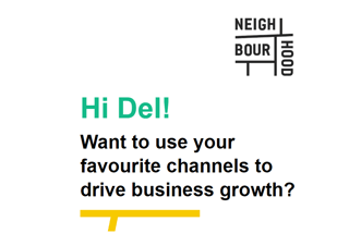
From "Hi Delphine!" to "Hi Del!" - My nearest and dearest call me Del! A simple and easy way to personalise the way you address your contacts -- find their nickname! 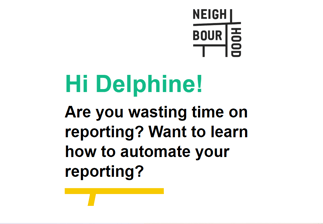
7. Incorporate striking visuals
Truth be told when it comes to reading, the majority of us are still kids at heart. Our eyes are naturally drawn to aesthetic graphics (and apparently to shiny things too). It’s going to be difficult to keep them interested if your email is rim filled with walls of text.
Include descriptive images, videos and GIFS to break up your written content. You could also include emojis! 😁 Emojis are a great way to convey emotion and help with the tone of your message. Your graphics will complement your copy so that your email recipients can immediately know what your email is about in a flash.
8. Use a responsive design
A responsive design ensures that no matter the device your email is being viewed on (whether it’s on a desktop, laptop or mobile device), the content will format to fit the screen.
Recipients will get the same user experience and view your email the way it was designed to be seen. Responsive design enhances user experience and improves email subscriber retention -- ain’t nobody got time for jumbled text and misplaced images.
9. Add an unsubscribe link/button
Unfortunately, as your business grows and the content you provide changes over time; so will the needs of your recipients. You may no longer be providing relevant content to some of your recipients anymore which is not only a waste of your resources but also most probably quite frustrating for your recipients.
For this reason, allow your recipients to opt out from your emails by providing a visible and easy to click button.
As a matter of fact, according to the Federal Trade Commission and CAN-SPAM Act you are legally required to include a clear explanation/way for subscribers to opt out of getting emails from you in the future.
10. A/B test your design
The whole point of carrying out A/B tests is to measure the change in responsiveness from recipients viewing different versions of your email. By designing and sending out “two” different versions of emails you’ll essentially (well hopefully), see which design clicks the most. You can modify the look and feel of your CTAs, fonts, placement of visuals and see what works best in terms of ability to convert and resonate with the highest number of recipients.
A great way to incorporate these 10 best practices when sending out your emails is to use email design software. In fact, many of these best practices can be automated while you’re designing and planning your emails this way. Let’s take a look at the top 2 options and how they compare.
Email Design Software
Mailchimp offers a wide variety of templates that allows you to customise your email design for your target audience. However, your options will be limited if you don't speak in 1s & 0s. You'll also have to upgrade to premium to access A/B testing and dynamic send times.
HubSpot’s email tool has everything Mailchimp offers, and more. HubSpot’s email editor is easy peasy to use and comes with a variety of templates to get you started. Of course, you can personalise them to meet your brand’s needs and your target audience. As you progress, you’ll unlock features like A/B testing and my personal favourite -- smart send times. Smart send time provides insight into your customer’s engagement by using data to find the right time to send out your right email so you can get it all right! Essentially, this feature allows you to maximise open and click rates by looking at engagement changes over a 24hr time period for several email sends. That way, you’re giving your emails your best shot!
Now that you've got all the tips you need to craft drool-worthy emails, it's time for you to get crackin! If you want more info on how Hubspot will help you in your quest for inbox perfection, hit the link below!


 1300 71 61 41